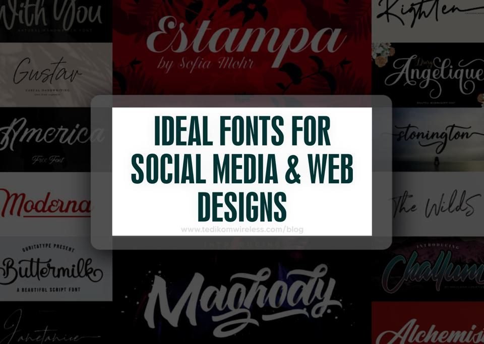
IDEAL FONT FOR SOCIAL MEDIA & WEB DEIGNS
Selecting the perfect fonts for websites and social media designs is a significant part of creating the visual identity of any online platform, including social media profiles and websites. The appropriate font may improve readability, communicate the personality of the business, and make the user interface visually appealing. When it comes to social media and online design, font selection has a big influence on how people view and interact with your material. This is a guide to help you choose the best fonts for your websites and social media projects.
- First, take readability into account
Choosing readability is a must when choosing fonts for web designs and social media platforms. Particularly on smaller screens or when users are rapidly scrolling through content, readability is crucial. Because of their sleek and contemporary appearance, sans- serif fonts like Roboto, Helvetica, and Arial are popular options for digital platforms. Such fonts can adjust well to various sizes and resolutions and are often easier to read on screens.
- Reflect Brand Personality
A brand’s personality and tone can be expressed through fonts. A lifestyle brand might use a more whimsical or elegant font to express its identity, whereas a technological company might go for a sleek, modern font to communicate innovation. To ensure consistency across all online channels, it is crucial that the fonts selected reflect the overall image of the company.
- Employ Contrast and Hierarchy
Using fonts to create a visual hierarchy in social media and online design can help direct audience attention and enhance user experience overall. Combining several font types can improve content flow and make a clear visual distinction. For example, you can use a bold headline font with a simpler body text font. Contrasting font types can also highlight design elements and create visual appeal.
- Responsive and Scalable Fonts
The increasing use of mobile devices requires the use of responsive and scalable fonts. Responsive fonts adapt to various screen sizes and resolutions, providing that the content is readable on a variety of devices. Scalable fonts can be resized without affecting quality, preserving readability and visual appeal on both large desktop screens and smaller mobile displays.
- Limit the Number of Fonts
Even if there is a large selection of fonts available, it can be tempting to utilize them all, but it’s usually preferable to keep the number of fonts used within a design to a minimum. A brand’s identity may be lost and confusion in appearance may result from using too many fonts. To ensure uniformity and consistency across the design, a good rule of advice is to limit your font selection to no more than two or three options.
- Consider Accessibility
While selecting fonts for online platforms, accessibility is a crucial factor to consider. Users with visual impairments may have a better experience if fonts are chosen with strong readability and distinct character lines. Making sure there is enough color contrast between the background and the text can also improve accessibility for all users.
In conclusion, font selection for websites and social media should be deliberate and well-thought-out. Designers and content producers can effectively improve the visual appeal and user experience of their online platforms by prioritizing readability, reflecting brand personality, building hierarchy, providing responsiveness, minimizing font variation, and taking accessibility into consideration. Ultimately, fonts that complement a brand’s identity, captivate an audience, and present information in an appealing and accessible way are the best choices for social media and online designs. Here is a link to read more on ideal font selection.


